
My Role
Led UX/UI design
UX researcher
Prototyper
Motion Designer

The Challenge
Fragmented Conversations
& Limited Guidance

The Problem
Snapchat’s chat interface mixes multiple content types without clear hierarchy and provides limited onboarding, reducing clarity, usability, and increasing interaction errors.
our goals
For Users
Retain existing users by enhancing their overall experience while attracting new users to join the platform.
Focus on improving the Chat features to strengthen engagement and user retention.
For Business
Drive sustainable revenue growth by increasing Snapchat+ subscriptions and improving user conversion rates.
Expand the user base and strengthen advertising and brand partnership opportunities.
Participant Recruitment Plan
Participant Breakdown by Age Group & Experience Level
We planed to recruit 16 participants representing a balanced mix of genders, age groups, and technology experience levels to ensure diverse perspectives. The group will include both novice and experienced users of mobile communication platforms, allowing us to observe distinct patterns in behavior, expectations, and challenges for a more complete understanding of user interaction.

Participant Recruitment Plan
Recruitment Strategy
We adopted a clear and friendly recruitment approach to attract participants who represent our target audience. A screening process will be conducted through a Google Form shared via digital link and QR code to ensure participants fit our criteria. This balanced composition allows us to gather diverse insights across different experience levels for a more comprehensive usability evaluation.


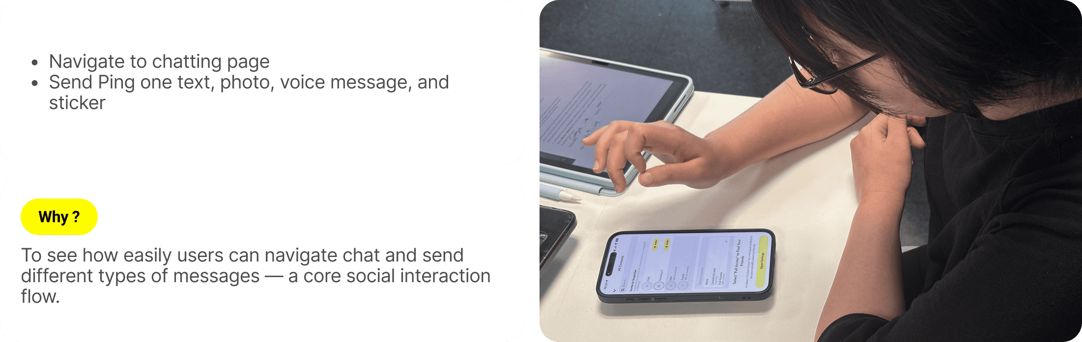
Testing Process & Metrics
Methodology

Quantitative Data
Task completion rate
Task completion time (per task)
Error encountered
Quiz success rate
System usability score

Qualitative Data
Screening form responses
Verbalization & Behavior
Post-task interview responses
Observed user frustrations and quick fixes



Data Analysis
Quantitative data
task completion time
On average, new users spent 43 seconds longer per task than experienced users.

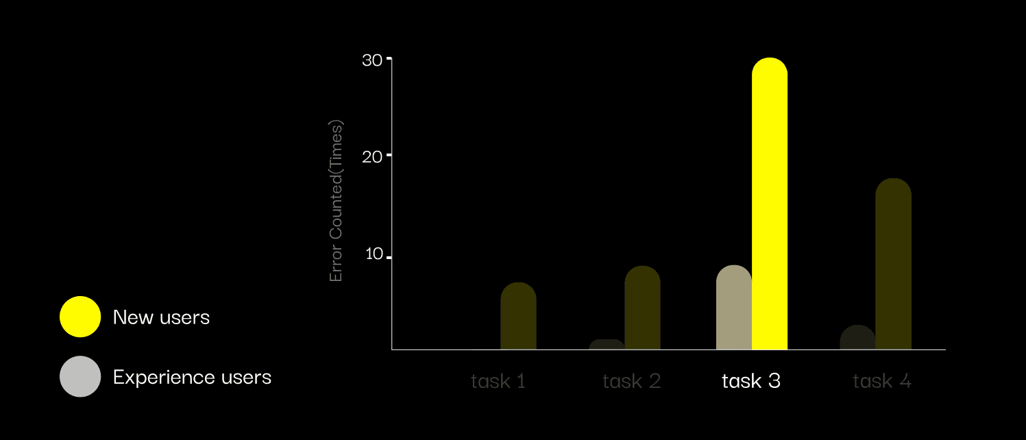
Task click error counted
In task3, new users made 22 more click errors than experienced users. From here, everything makes sense.
Task Completion Rate
While the completion rate was high, many users, especially new users, completed tasks through indirect paths.

System Usability Scale (SUS)
New users rated Snapchat 43.44, which falls into not acceptable.

Key Insights
Issues to solve
Message List View
Multiple gestures (long-press, swipe) live in the same small area, each triggering a different action
No clear visual distinction between actions, causing hesitation and misclicks for first-time users
Chat Screen
Actions like "Save," "Reply," and "Forward" only appear after long-press or swipe, hidden from view by default
Icons lack text labels, making their function unclear

redesign 1
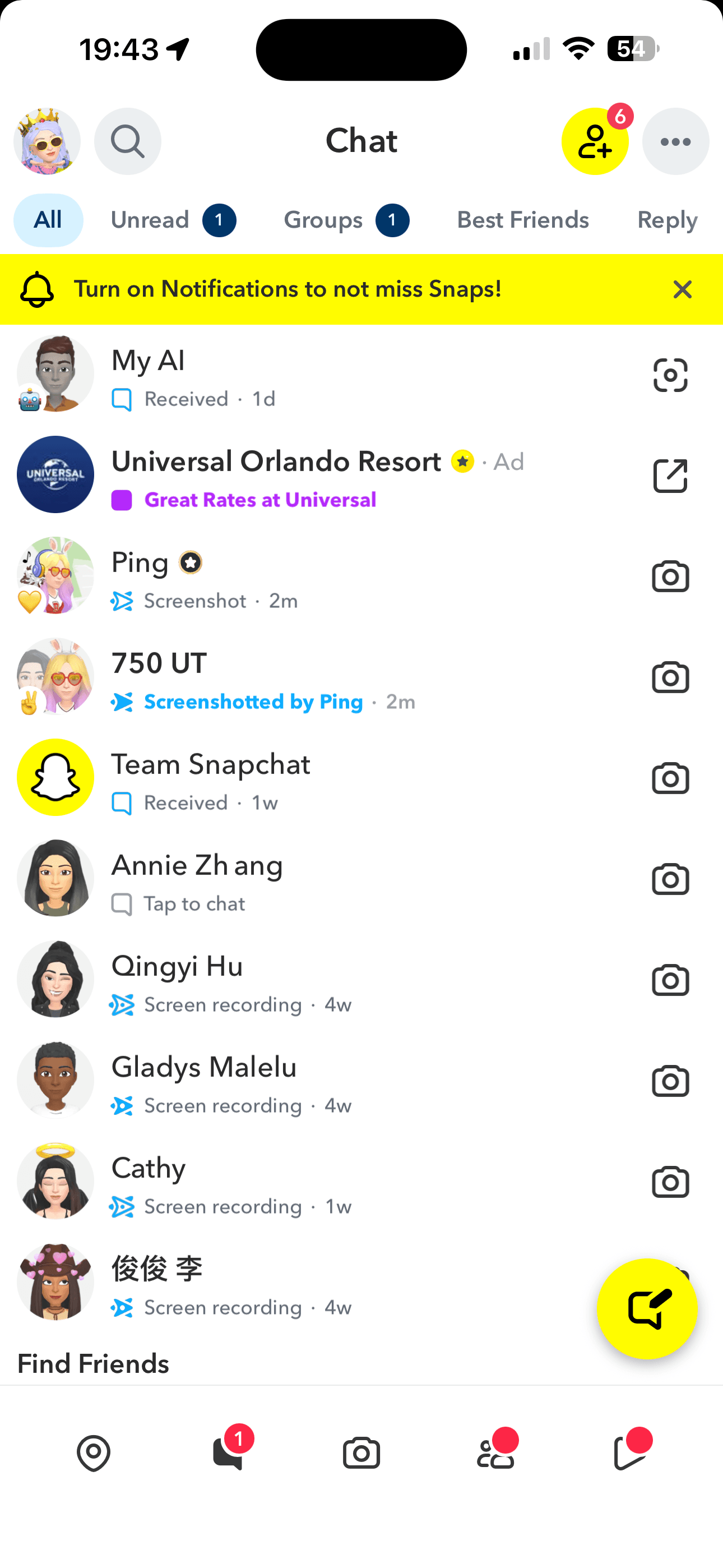
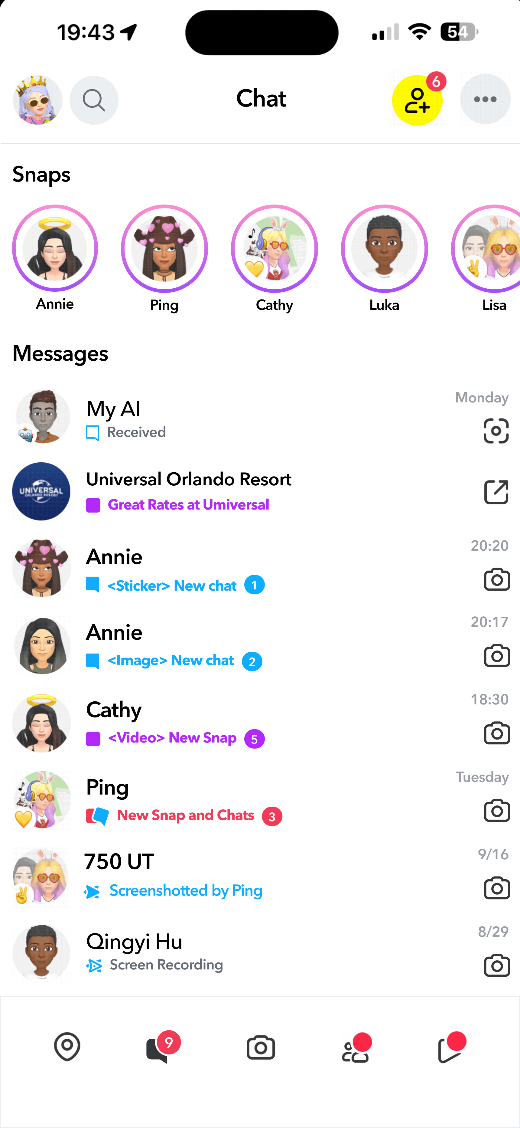
Friends List Page:
Improving Message Access & Interaction

before

after
Added a Snap Message Preview
Users can quickly view all Snaps without relying on complex gestures.
Refined Timestamp System
Improved Message Indicators and Visual Clarity
Added unread message counts and explicit media labels (e.g., “Sticker,” “Snap,” “Chat”).

redesign 2
Chat Interface:
Simplified Gestures & Clearer Controls
Added a Save Message Button
Clear color-coding makes saved states instantly recognizable, while a separate button placement helps reduce accidental taps.
Optimize Voice Message Controls
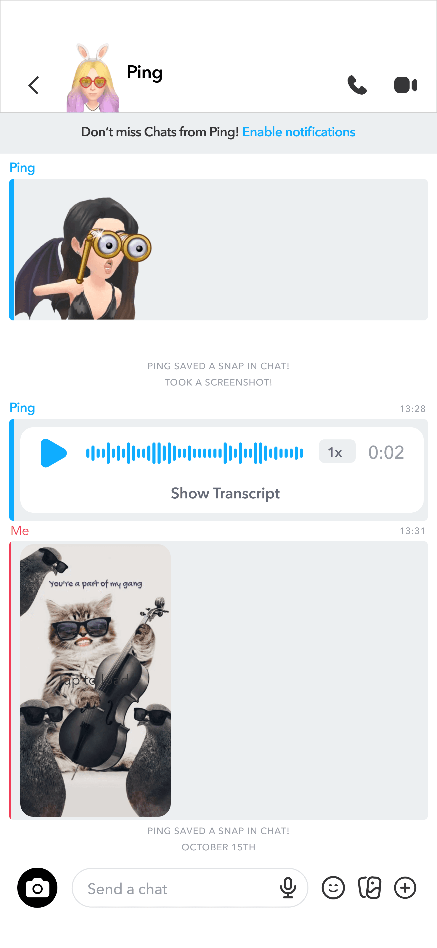
before
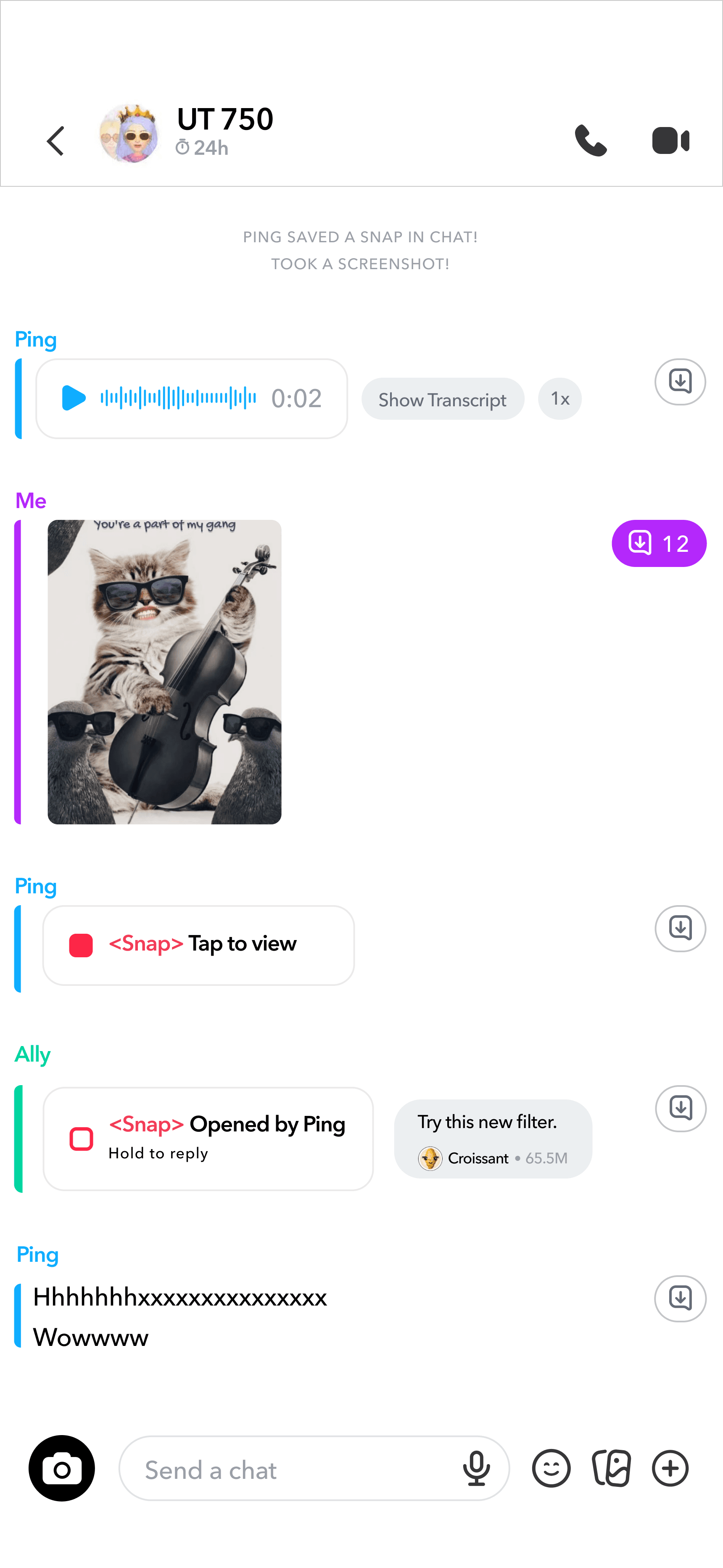
after

redesign 3
make disappearing message rules clear & easy to manage


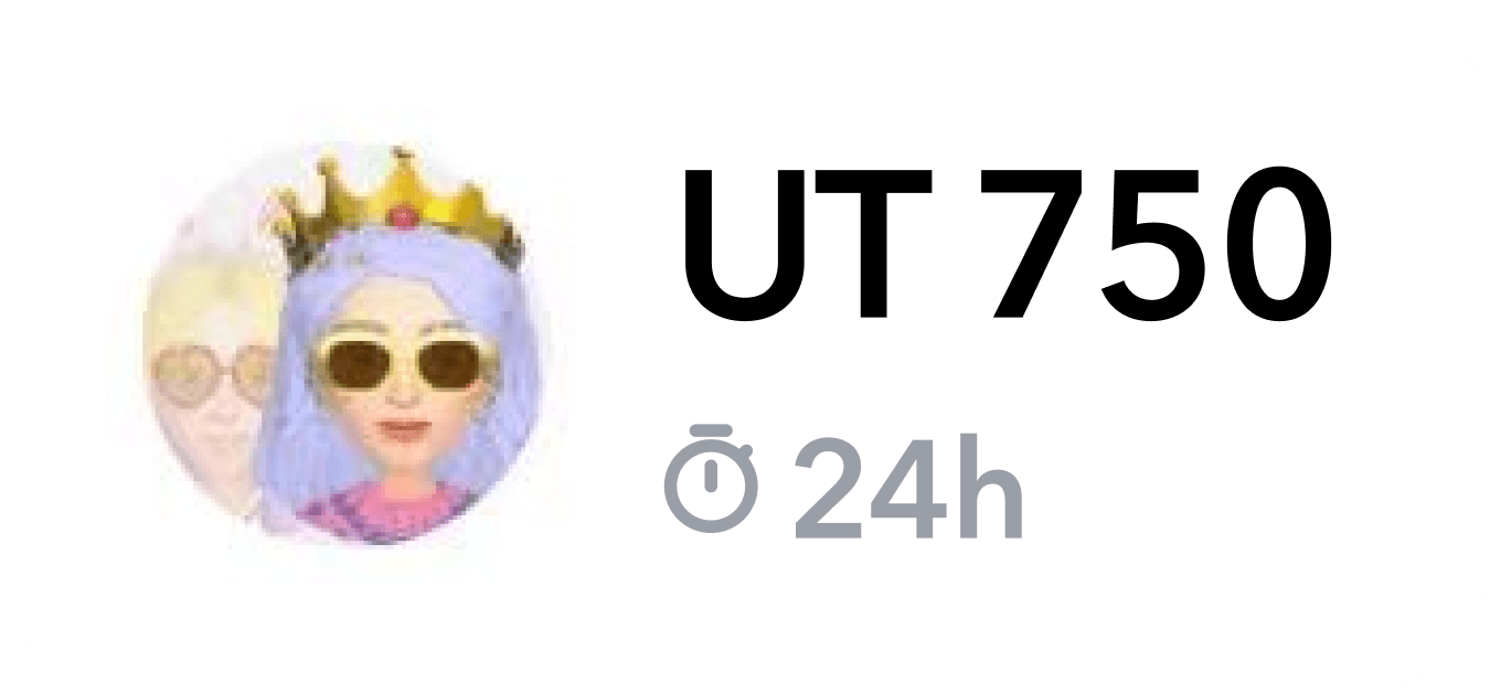
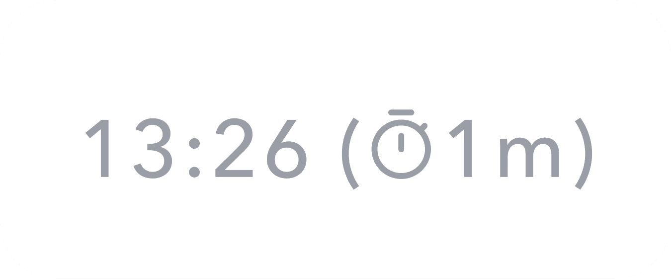

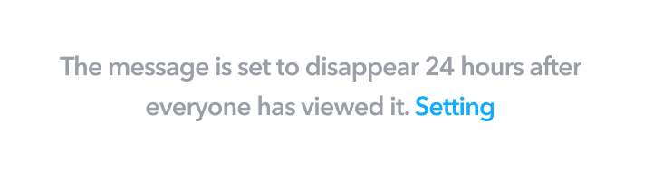
Disappearing message Notification
New user can get a notifiaction of the disappearing message when they first use chat function.
User can use“Setting” to change how long they want to keep all messages in chat, such as “After Viewing”,”24 Hours after Viewing”,”7 Days after Viewing”, or”Never”.
Visible Timer
User can see the “Setting”/”Set time” under their friends name.
A “Timer” next to the time of each message.
redesign 4
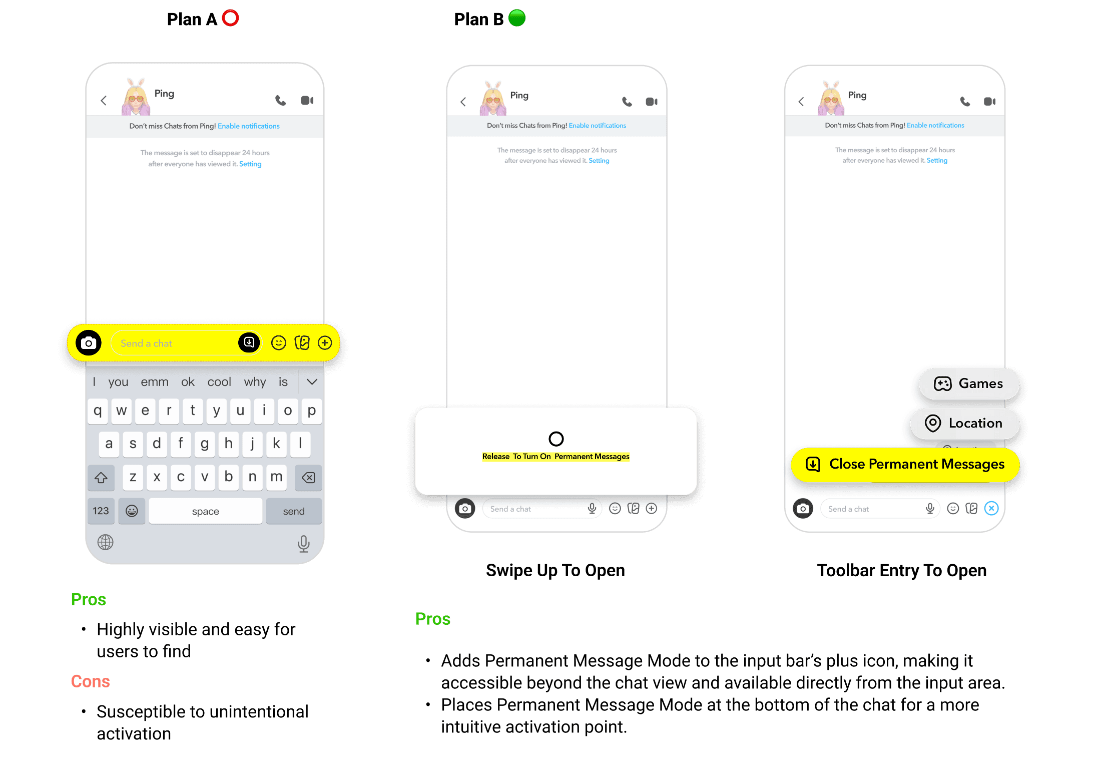
Introduce a “permanent Message” Mode for Important Conversations
Enable or Disable Permanent Messages
Turn Permanent Messages on or off to keep all messages indefinitely, with both users notified of any changes.
Auto-Saved Messages Indicator
In Permanent Mode, the Save button turns yellow to show messages stay in the chat.
Toggle Permanent Message Mode
Use the “Add” button to switch Permanent Messages on or off.
Swipe Up to Open
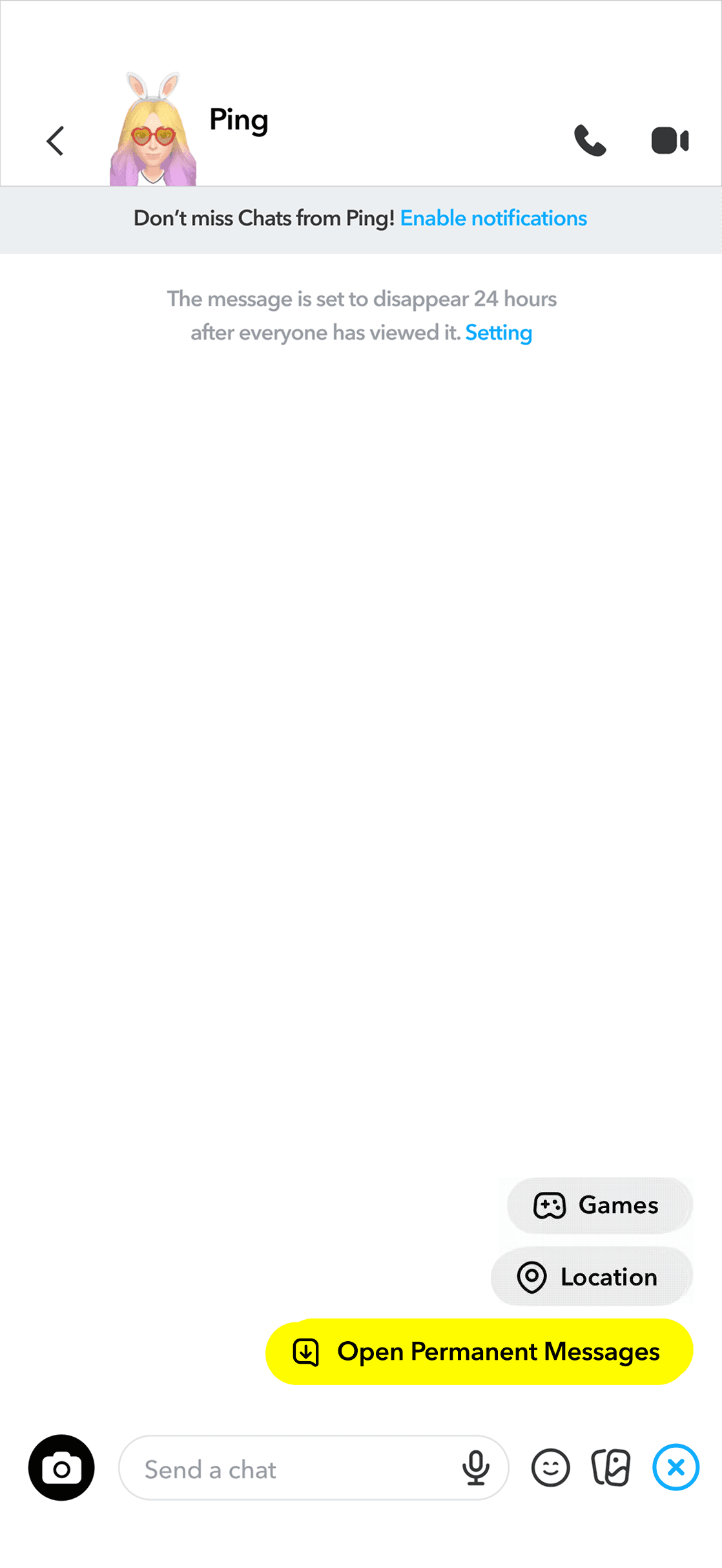
Toolbar Entry to Open
redesign 5
Introduce Interactive Onboarding
with Short Animations or Gesture Tutorials
Message Access Shortcut
Message Reopening
Quick Search
The tutorial teaches quick, gesture-based search using simple swipes and taps.
Turn Off Anytime
Users can turn off the tutorial anytime for full control while still navigating the chat confidently.
Quick Access: Swipe Right to Chat
A simple gesture that makes navigation faster and easier to learn.
Solution Overview
Simplify the learning process. Boost engagement.
To improve the user experience, we made messaging, snaps, and videos more organized, discoverable, and easier to manage while introducing guided onboarding to help new users navigate the interface with confidence.

© 2026 by Ping